library(sf)
library(ggplot2)
library(tmap)
library(dplyr)
library(classInt)
library(janitor)Preface 🗣️
This post provides an introduction to Maps and Geospatial Data using R programming. Download the source file here.
Spatial Data
This post/demonstration uses spatial data, which comes in different formats, shapes, and sizes. This is beyond the scope of this post, but please read read more from these resources:
Snippet from “R for the Rest of Us”
“When I first started learning R, I considered it a tool for working with numbers, not shapes, so I was surprised when I saw people using it to make maps…
You might think you need specialized mapmaking software like ArcGIS to make maps, but it’s an expensive tool. And while Excel has added support for mapmaking in recent years, its features are limited (for example, you can’t use it to make maps based on street addresses). Even QGIS, an open source tool similar to ArcGIS, still requires learning new skills.
Using R for mapmaking is more flexible than using Excel, less expensive than using ArcGIS, and based on syntax you already know…
You don’t need to be a GIS expert to make maps, but you do need to understand a few things about how geospatial data works, starting with its two main types: vector and raster. Vector data uses points, lines, and polygons to represent the world. Raster data, which often comes from digital photographs, ties each pixel in an image to a specific geographic location.
In the past, working with geospatial data meant mastering competing standards, each of which required learning a different approach. Today, though, most people use the simple features model (often abbreviated as sf) for working with vector geospatial data, which is easier to understand.”
Keyes, D. (2024). R for the Rest of Us : A Statistics-Free Introduction. (1st ed.). No Starch Press.
Overview
We will do the following:
- Read in a geoJSON file with the
sfpackage - Inspect the spatial and non-spatial dimensions of the data
- Inspect and transform the coordinate reference system
- Read county level data and merge with spatial data
- Create a choropleth map with the
ggplot2package. - Create a choropleth map with the
tmappackage.
Prepare Data
Load Packages
We will use the following packages in this tutorial:
sf: to manipulate spatial dataggplot2: to visualize and create mapsggrepel: for labelling on ggplotstmap: to visualize and create mapsdplyr: to create new columns & merge dataclassInt: to categorize numeric datajanitor: clean/standardize column names
First, load the required packages. Note: You may see messages about GEOS, GDAL, and PROJ. These refer to software libraries that allow you to work with spatial data. You results may differ if you are using a differnt version of R and/or different package versions. Check out my session info below.
Prepare Spatial Data
Our primary spatial data comes from a geoJSON file of Kentucky Counties from the KY Gov Maps Open Data Portal. It contains polygons/shapes for all 120 Kentucky Counties.
ky_county_poly <- sf::st_read("https://services3.arcgis.com/ghsX9CKghMvyYjBU/arcgis/rest/services/Ky_County_Polygons_WM/FeatureServer/0/query?outFields=*&where=1%3D1&f=geojson") |>
  janitor::clean_names() |>
  select(fips = fips_id, name = name2, pop10, geometry) |>
  # convert fips to character with leading zeros (not strictly required for KY county fips codes)
  mutate(fips = sprintf("%05d", fips))
Reading layer `OGRGeoJSON' from data source
`https://services3.arcgis.com/ghsX9CKghMvyYjBU/arcgis/rest/services/Ky_County_Polygons_WM/FeatureServer/0/query?outFields=*&where=1%3D1&f=geojson'
using driver `GeoJSON'
Simple feature collection with 120 features and 47 fields
Geometry type: MULTIPOLYGON
Dimension: XY
Bounding box: xmin: -89.57121 ymin: 36.49706 xmax: -81.96479 ymax: 39.14774
Geodetic CRS: WGS 84Non-Spatial Inspection
First we look at a non-spatial view. Note the 120 rows and 3 columns.
dplyr::glimpse(ky_county_poly)Rows: 120
Columns: 4
$ fips <chr> "21001", "21003", "21005", "21007", "21009", "21011", "21013"…
$ name <chr> "Adair", "Allen", "Anderson", "Ballard", "Barren", "Bath", "B…
$ pop10 <int> 18656, 19956, 21421, 8249, 42173, 11591, 28691, 118811, 19985…
$ geometry <MULTIPOLYGON [°]> MULTIPOLYGON (((-85.16518 3..., MULTIPOLYGON (((…The last column, geometry, contains our spatial polygon data. Note that it’s type is MULTIPOLYGON. This tells us the geometry type which will impact how we can map the feature in later functions. Note the fips column; we’ll use this ID as the key column to merge data later.
Spatial Inspection
Let’s inspect the raw spatial data:
plot(sf::st_geometry(ky_county_poly))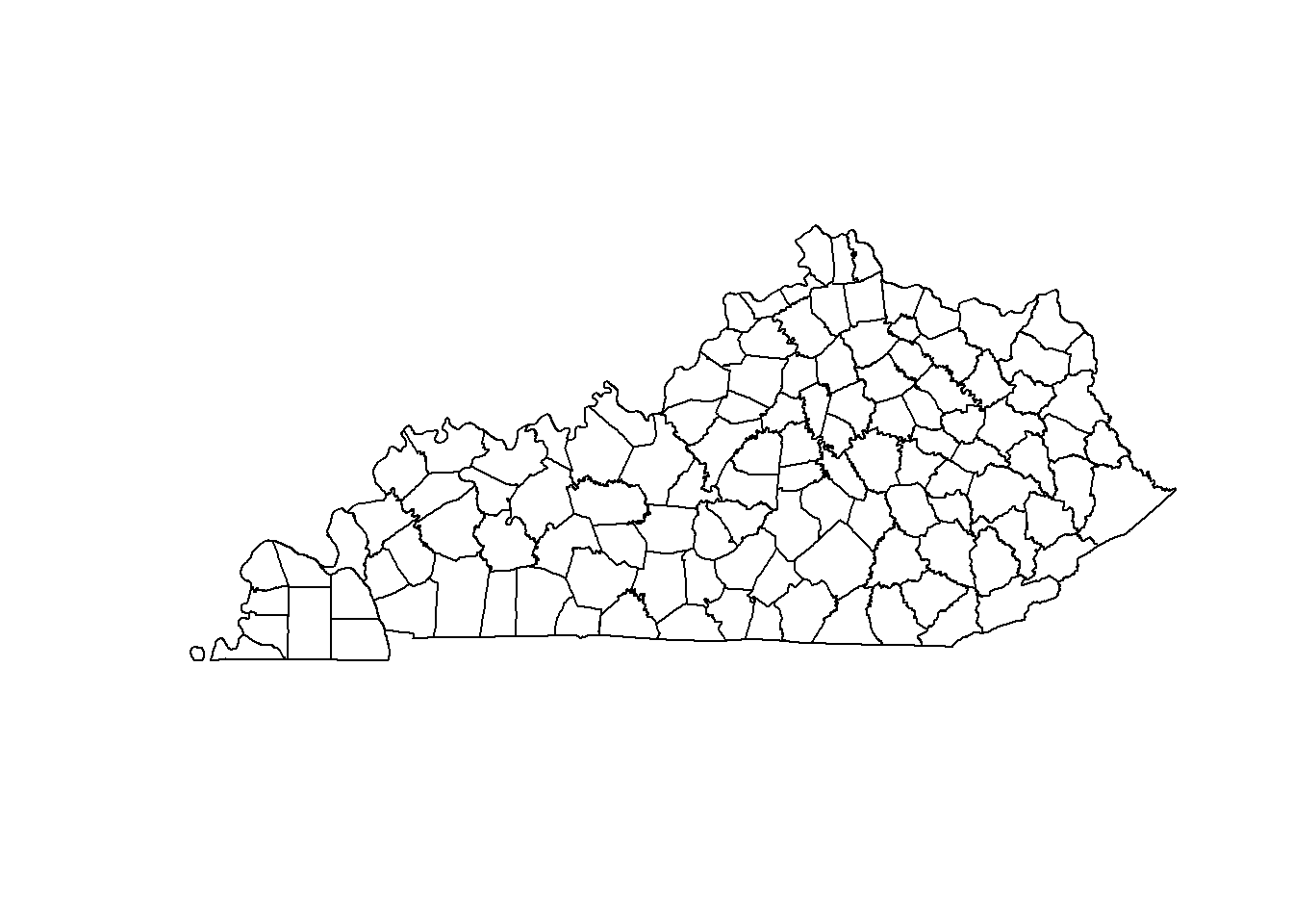
CRS Inspection
Check out the coordinate reference system (CRS). It looks to be EPSG:4326, which is the WGS 84 (The Global Grid) CRS widely used by Google Maps or other web mapping services. Confused on coordinate system terminology? Check out this document.
st_crs(ky_county_poly)Coordinate Reference System:
User input: WGS 84
wkt:
GEOGCRS["WGS 84",
DATUM["World Geodetic System 1984",
ELLIPSOID["WGS 84",6378137,298.257223563,
LENGTHUNIT["metre",1]]],
PRIMEM["Greenwich",0,
ANGLEUNIT["degree",0.0174532925199433]],
CS[ellipsoidal,2],
AXIS["geodetic latitude (Lat)",north,
ORDER[1],
ANGLEUNIT["degree",0.0174532925199433]],
AXIS["geodetic longitude (Lon)",east,
ORDER[2],
ANGLEUNIT["degree",0.0174532925199433]],
ID["EPSG",4326]]Explore Projections
Lets see how switching CRS changes our object.
Transform CRS
WGS 84 would work fine for our needs, but let’s use a Kentucky specific CRS. You can use the database search features here to find CRS options. The NAD83(2011)/Kentucky Single Zone (ftUS) CRS will fit our needs and convert the unit used for measurement. The CRS registry number is 6473.
To transform our CRS, we use the st_transform() function. Check out the CRS of our new object. The units now show “US survey foot.”
ky_county_poly_6473 <- st_transform(ky_county_poly, crs = "EPSG:6473")

st_crs(ky_county_poly_6473)
Coordinate Reference System:
User input: EPSG:6473
wkt:
PROJCRS["NAD83(2011) / Kentucky Single Zone (ftUS)",
BASEGEOGCRS["NAD83(2011)",
DATUM["NAD83 (National Spatial Reference System 2011)",
ELLIPSOID["GRS 1980",6378137,298.257222101,
LENGTHUNIT["metre",1]]],
PRIMEM["Greenwich",0,
ANGLEUNIT["degree",0.0174532925199433]],
ID["EPSG",6318]],
CONVERSION["SPCS83 Kentucky Single Zone (US survey foot)",
METHOD["Lambert Conic Conformal (2SP)",
ID["EPSG",9802]],
PARAMETER["Latitude of false origin",36.3333333333333,
ANGLEUNIT["degree",0.0174532925199433],
ID["EPSG",8821]],
PARAMETER["Longitude of false origin",-85.75,
ANGLEUNIT["degree",0.0174532925199433],
ID["EPSG",8822]],
PARAMETER["Latitude of 1st standard parallel",37.0833333333333,
ANGLEUNIT["degree",0.0174532925199433],
ID["EPSG",8823]],
PARAMETER["Latitude of 2nd standard parallel",38.6666666666667,
ANGLEUNIT["degree",0.0174532925199433],
ID["EPSG",8824]],
PARAMETER["Easting at false origin",4921250,
LENGTHUNIT["US survey foot",0.304800609601219],
ID["EPSG",8826]],
PARAMETER["Northing at false origin",3280833.333,
LENGTHUNIT["US survey foot",0.304800609601219],
ID["EPSG",8827]]],
CS[Cartesian,2],
AXIS["easting (X)",east,
ORDER[1],
LENGTHUNIT["US survey foot",0.304800609601219]],
AXIS["northing (Y)",north,
ORDER[2],
LENGTHUNIT["US survey foot",0.304800609601219]],
USAGE[
SCOPE["State-wide spatial data management."],
AREA["United States (USA) - Kentucky."],
BBOX[36.49,-89.57,39.15,-81.95]],
ID["EPSG",6473]]Compare CRS
Let’s compare the basic maps from both spatial data sets. They’re very similar! If we only cared about creating a nice choropleth map, this would have little impact. We will proceed with using the Kentucky single zone projected spatial data.
ky_county_poly_tmap <- tm_shape(ky_county_poly) +
  tm_fill(col = "gray90") +
  tm_title(text = "EPSG 4326: WGS 84")

ky_county_poly_6473_tmap <- tm_shape(ky_county_poly_6473) +
  tm_fill(col = "gray90") +
  tm_title(text = "EPSG 6473: NAD83(2011)/Kentucky Single Zone (ftUS)")

tmap_arrange(ky_county_poly_tmap, ky_county_poly_6473_tmap)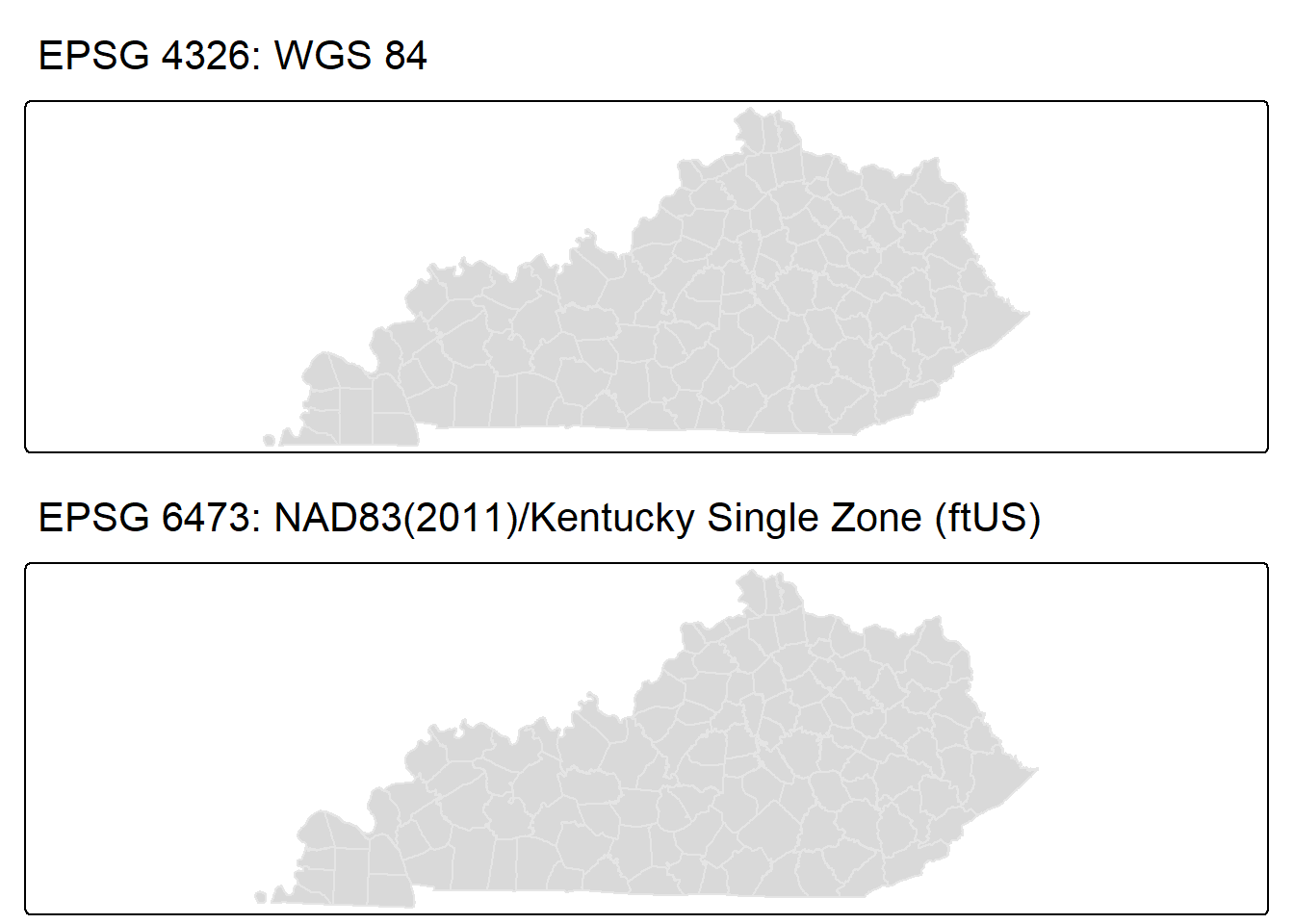
Prepare County Data
In this tutorial, we’ll use the County Health Rankings and Roadmaps 2025 data. The life_expectancy_raw_value column is the average life expectancy for all KY Counties in 2025. First, we remove the first row because it contains meta-data, then we clean the column names. Next, we filter only for KY values, then select and rename two columns to create fips and life_expectancy.
# Read the Excel file
ky_county_health_rankings_2025 <- read.csv("https://www.countyhealthrankings.org/sites/default/files/media/document/analytic_data2025_v2.csv") |>
  # remove first row which contains meta-data
  slice(2:n()) |>
  janitor::clean_names()

ky_county_life_exp_2025 <- ky_county_health_rankings_2025 |>
  filter(state_abbreviation == "KY") |>
  select(fips = x5_digit_fips_code, life_expectancy = life_expectancy_raw_value) |>
  mutate(life_expectancy = round(as.numeric(life_expectancy), digits = 2))
Inspect Data
The fips column is now standardized to match the spatial data. It is already a character type. Note the 121 rows. The first rows is the statewide value (fips == 21000).
glimpse(ky_county_life_exp_2025)Rows: 121
Columns: 2
$ fips <chr> "21000", "21001", "21003", "21005", "21007", "21009", …
$ life_expectancy <dbl> 73.31, 71.66, 73.11, 74.41, 72.90, 73.68, 68.83, 67.29…Merge Data
Let’s merge the county level values data (ky_county_life_exp_2025) with the spatial data (ky_county_poly_6473). We will use the left_join() function from dplyr and join on the matching key col fips. The left join will filter out the statewide row since there is no match in the spatial data set.
ky_county_poly_join <- dplyr::left_join(
  ky_county_poly_6473,
  ky_county_life_exp_2025,
  by = join_by(fips)
)
Take a look at the resulting data set. We still have 120 rows
glimpse(ky_county_poly_join)Rows: 120
Columns: 5
$ fips <chr> "21001", "21003", "21005", "21007", "21009", "21011", …
$ name <chr> "Adair", "Allen", "Anderson", "Ballard", "Barren", "Ba…
$ pop10 <int> 18656, 19956, 21421, 8249, 42173, 11591, 28691, 118811…
$ life_expectancy <dbl> 71.66, 73.11, 74.41, 72.90, 73.68, 68.83, 67.29, 78.00…
$ geometry <MULTIPOLYGON [US_survey_foot]> MULTIPOLYGON (((5091331 363.…Choropleth Maps
We will focus on choropleth maps in this tutorial. A choropleth map simply shades geographic regions by numeric values of our choice. We’re using life_expectancy.
ggplot2
In this first map, I used the fill aesthetic in the geom_sf() function, which fills the county polygons by life_expectancy. Notice how the default legend and scale use a color gradient. This is not what you’d typically use for a choropleth map and it makes interpretations harder. To fix this, we need to create our own categories for ggplot2. I am not aware of any helper functions to define the scale/classification for typical choropleth options. This resource defines common classification schemes.
my_ggplot_map <- ggplot(ky_county_poly_join) +
  geom_sf(
    aes(fill = life_expectancy),
    color = "grey50",
    linewidth = 0.75
  ) +
  theme_void() +
  theme(
    plot.margin = margin(0, 1, 0, 1, "cm"),
    plot.background = element_rect(fill = "white"),
    legend.position = "inside",
    legend.position.inside = c(0.075,0.85),
    legend.box = "vertical",
    legend.justification = "left",
    legend.box.just = "left",
    legend.box.spacing = unit(0.5, "lines"),
    legend.spacing = unit(0.1, "lines")
  ) +
  labs(caption = "Source: County Health Rankings & Roadmaps (CHR&R), 2025")

my_ggplot_map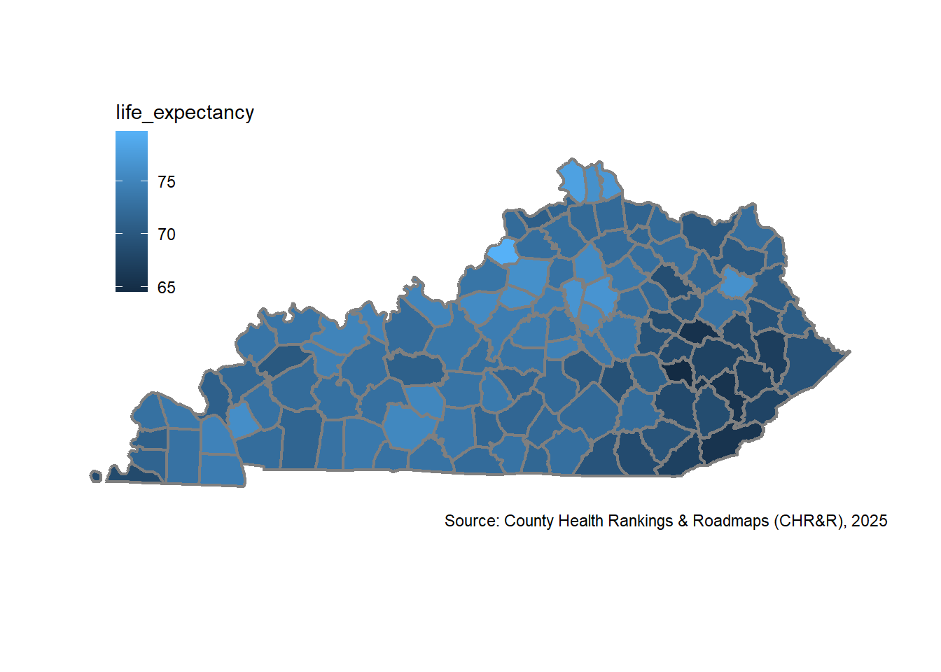
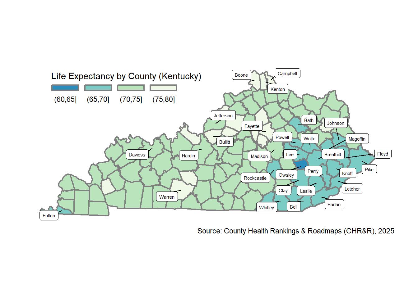
Let’s use the classIntervals() function from the classInt package to define “pretty” breaks, which are similar to “natural breaks,” but attempt to use pretty whole integer numbers for breaks. I’ll display a few labels for counties: the 20 lowest average life expectancy OR the 10 highest population counties. I use the ggrepel package and geom_label_repel() function to add the labels, which will automatically “repel” them to avoid overlap.
# create data for labels
myLabels <- ky_county_poly_join |>
  filter(
    life_expectancy %in% head(sort(ky_county_poly_join$life_expectancy), 20) |
      pop10 %in% tail(sort(ky_county_poly_join$pop10), 10)
  )

my_ggplot_map <- ky_county_poly_join |>
  mutate(life_expectancy_pretty = cut(
      life_expectancy,
      breaks = classIntervals(life_expectancy, n = 5, style = "pretty")$brks,
      digits = 2
  )) |>
  ggplot() +
  geom_sf(
    aes(fill = life_expectancy_pretty),
    color = "grey50",
    linewidth = 0.75
  ) +
  ggrepel::geom_label_repel(
    data = myLabels,
    aes(label = name, geometry = geometry),
    size = 2,
    segment.color = "black",
    stat = "sf_coordinates",
    min.segment.length = 0
  ) +
  scale_fill_brewer(
    name = "Life Expectancy by County (Kentucky)",
    palette = "GnBu",
    direction = -1,
    guide = guide_legend(
      keyheight = unit(3, units = "mm"),
      keywidth = unit(12, units = "mm"),
      label.position = "bottom",
      nrow = 1
    )
  ) +
  theme_void() +
  theme(
    plot.margin = margin(0, 1, 0, 1, "cm"),
    plot.background = element_rect(fill = "white"),
    legend.position = "inside",
    legend.position.inside = c(0.075,0.85),
    legend.box = "vertical",
    legend.justification = "left",
    legend.box.just = "left",
    legend.box.spacing = unit(0.5, "lines"),
    legend.spacing = unit(0.1, "lines")
  ) +
  labs(caption = "Source: County Health Rankings & Roadmaps (CHR&R), 2025")

my_ggplot_map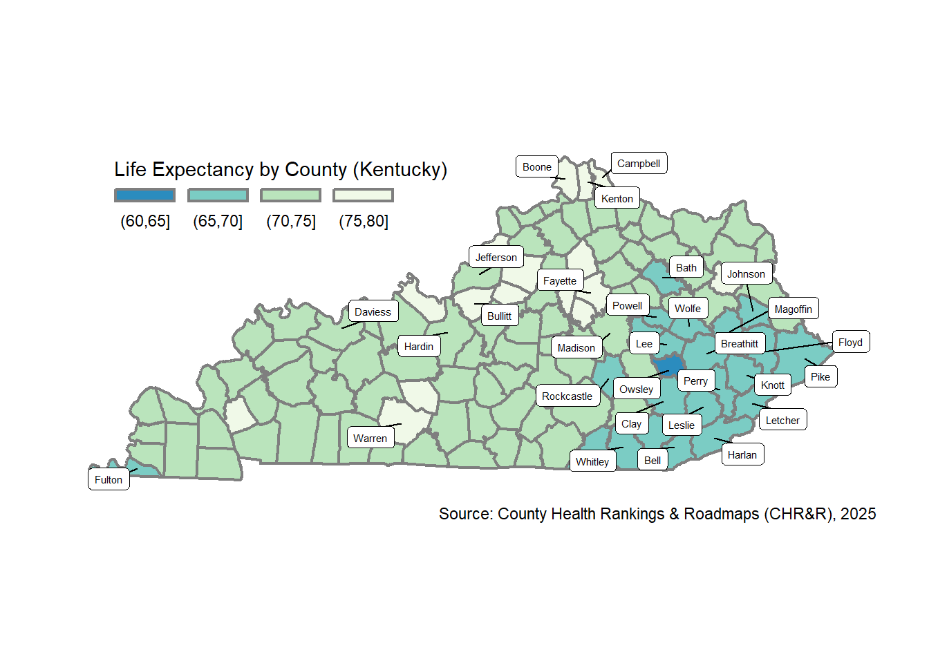
tmap
Following the principles of the grammer of graphics, tmap ergonomics follow similar syntax/feel to ggplot2.
The tm_shape() function begins the map plot, followed by the tm_polygons() function to define the county fill details. Note that tmap let’s use define the scale (and therefore classification method) using the tm_scale_intervals() function. Howerver, there is no ggrepel equivalent for tmap yet. See this.
my_tmap_map <- tm_shape(ky_county_poly_join, unit = "miles") +
  tm_polygons(
    fill = "life_expectancy", # fill color
    fill.scale = tm_scale_intervals(style = "pretty", values = "-brewer.gn_bu"),
    fill.legend = tm_legend(
      title = "Life Expectancy by County (Kentucky)",
      orientation = "landscape",
      width = 18,
      frame = FALSE
    ),
    col = "gray50", # border color
    lwd = 2 # line width
    ) +
  tm_layout(
    frame = FALSE,
    legend.position = c("left", "top")
  ) +
  tm_credits(
    "Source: County Health Rankings & Roadmaps (CHR&R), 2025",
    position = tm_pos_in(0.4,0)
  )

my_tmap_map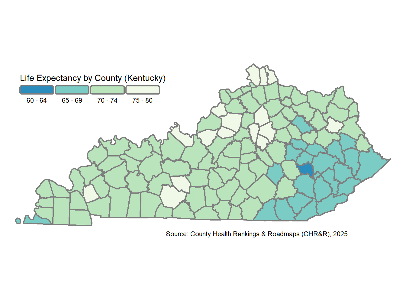
Comparison
They are very similar!
tmap Map

ggplot2 Map
More resources
- Geocomputation with R: Making Maps with R: great demonstration of scale/classification styles.
- Spatial Data Science (R)
- Choropleth Maps – A Guide to Data Classification
- R for the Rest of Us: Maps and Geospatial Data
- Opioid Environment Toolkit for R-Spatial
Reproducibility
Below, you’ll see my R version, platform, OS (Windows), and all required packages for this exercise.
sessionInfo()R version 4.4.1 (2024-06-14 ucrt)
Platform: x86_64-w64-mingw32/x64
Running under: Windows 11 x64 (build 22631)
Matrix products: default
locale:
[1] LC_COLLATE=English_United States.utf8
[2] LC_CTYPE=English_United States.utf8
[3] LC_MONETARY=English_United States.utf8
[4] LC_NUMERIC=C
[5] LC_TIME=English_United States.utf8
time zone: America/New_York
tzcode source: internal
attached base packages:
[1] stats graphics grDevices datasets utils methods base
other attached packages:
[1] janitor_2.2.1 classInt_0.4-11 dplyr_1.1.4 tmap_4.2
[5] ggplot2_4.0.0 sf_1.0-21
loaded via a namespace (and not attached):
[1] gtable_0.3.6 xfun_0.50 raster_3.6-32 htmlwidgets_1.6.4
[5] ggrepel_0.9.6 lattice_0.22-6 vctrs_0.6.5 tools_4.4.1
[9] crosstalk_1.2.2 generics_0.1.3 parallel_4.4.1 tibble_3.2.1
[13] proxy_0.4-27 pkgconfig_2.0.3 KernSmooth_2.23-24 data.table_1.16.4
[17] RColorBrewer_1.1-3 S7_0.2.0 leaflet_2.2.3 lifecycle_1.0.4
[21] stringr_1.5.1 compiler_4.4.1 farver_2.1.2 terra_1.8-70
[25] codetools_0.2-20 leafsync_0.1.0 leaflegend_1.2.1 snakecase_0.11.1
[29] stars_0.6-8 htmltools_0.5.8.1 class_7.3-22 yaml_2.3.10
[33] pillar_1.10.1 lwgeom_0.2-14 wk_0.9.4 abind_1.4-8
[37] tidyselect_1.2.1 digest_0.6.37 stringi_1.8.4 labeling_0.4.3
[41] fastmap_1.2.0 grid_4.4.1 colorspace_2.1-1 cli_3.6.3
[45] logger_0.4.1 magrittr_2.0.3 maptiles_0.10.0 base64enc_0.1-3
[49] XML_3.99-0.19 cols4all_0.9 leafem_0.2.5 e1071_1.7-16
[53] withr_3.0.2 scales_1.4.0 sp_2.2-0 lubridate_1.9.4
[57] timechange_0.3.0 rmarkdown_2.29 png_0.1-8 evaluate_1.0.3
[61] knitr_1.49 tmaptools_3.3 s2_1.1.9 rlang_1.1.4
[65] Rcpp_1.1.0 glue_1.8.0 DBI_1.2.3 renv_1.1.4
[69] jsonlite_1.8.9 R6_2.5.1 spacesXYZ_1.6-0 units_1.0-0